Learn About Best Practices
All
21 CFR Part 11AnnouncementArtificial IntelligenceAudit ManagementBest PracticesBiotechnologyCAPAChange ManagementClinicalComplaint ManagementCosmeticsData and AnalyticsDeviationsDocument ManagementeQMSInside DotISO 13485Life SciencesManufacturingMedical DevicePharmaceuticalQuality 4.0Regulatory ComplianceReturn on InvestmentRisk ManagementSaaSTraining Management

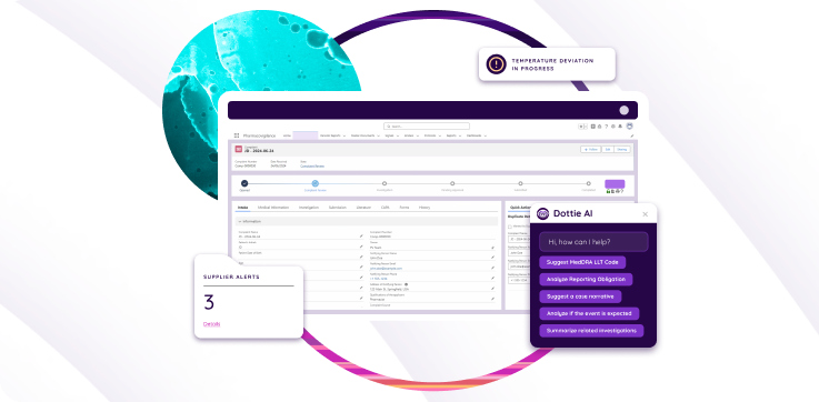
Deviation Management in Life Sciences: Process, Examples…
July 2026

8 Essential Questions for Clinical Data Management
November 2024
Key factors that drive a successful eQMS…
February 2023
6 Essential Features to Look for in…
January 2023

8 Key Principles of Quality Management
October 2022

QMS 101: Medical Device Validation
October 2022

QMS 101: Pharmaceutical Quality Management System
September 2022

The Ultimate Guide to ISO 9001 QMS
September 2022

5 Barriers to Enacting a Future-Ready Digital…
August 2022

Quality Management System (QMS) for Medical Device
June 2022

What is a Pareto Diagram, and How…
March 2022
5 Necessary Steps for Building a Risk…
January 2022

Scope Creep: Four Basics for Avoiding It
August 2021

Change – the psychology of crossing the…
May 2021
How to Migrate from a Legacy QMS…
April 2021